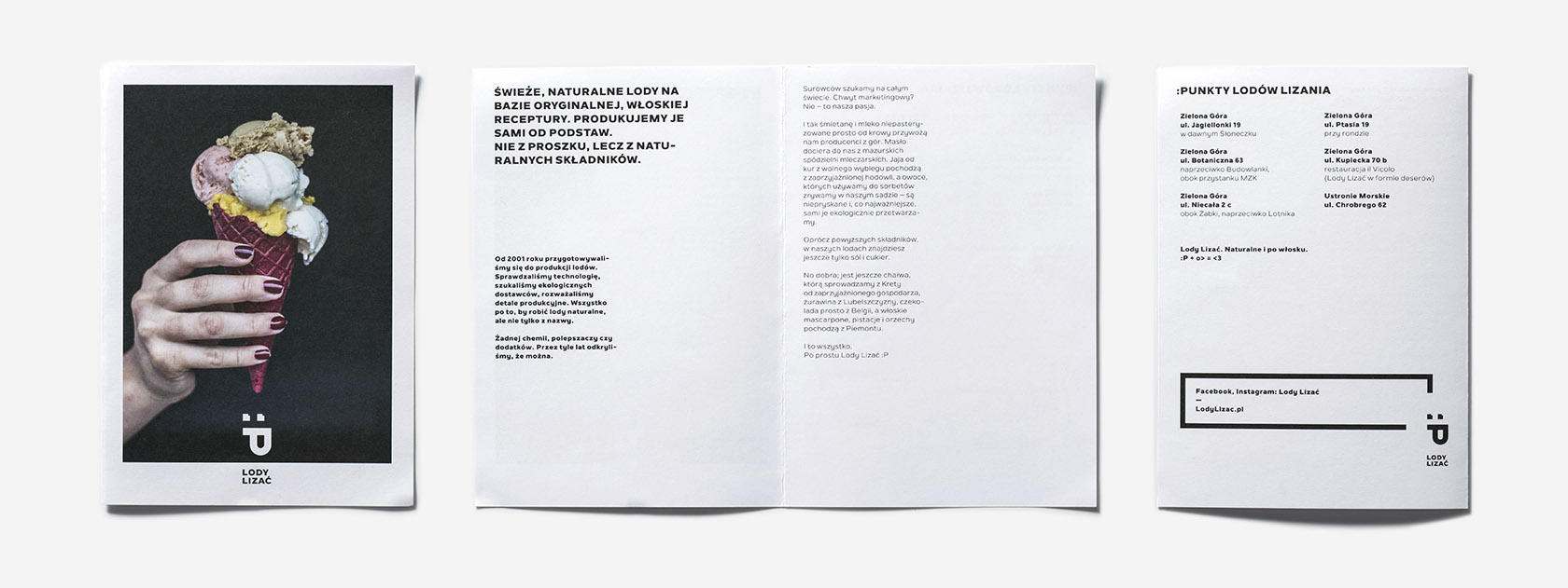
Lody
Lizać
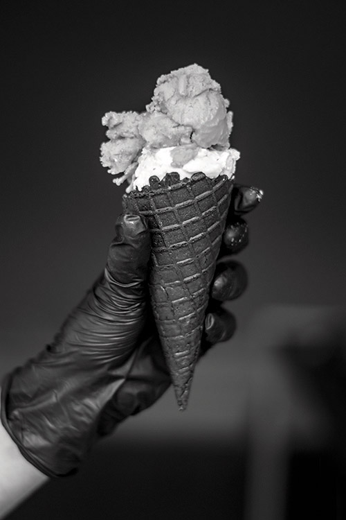
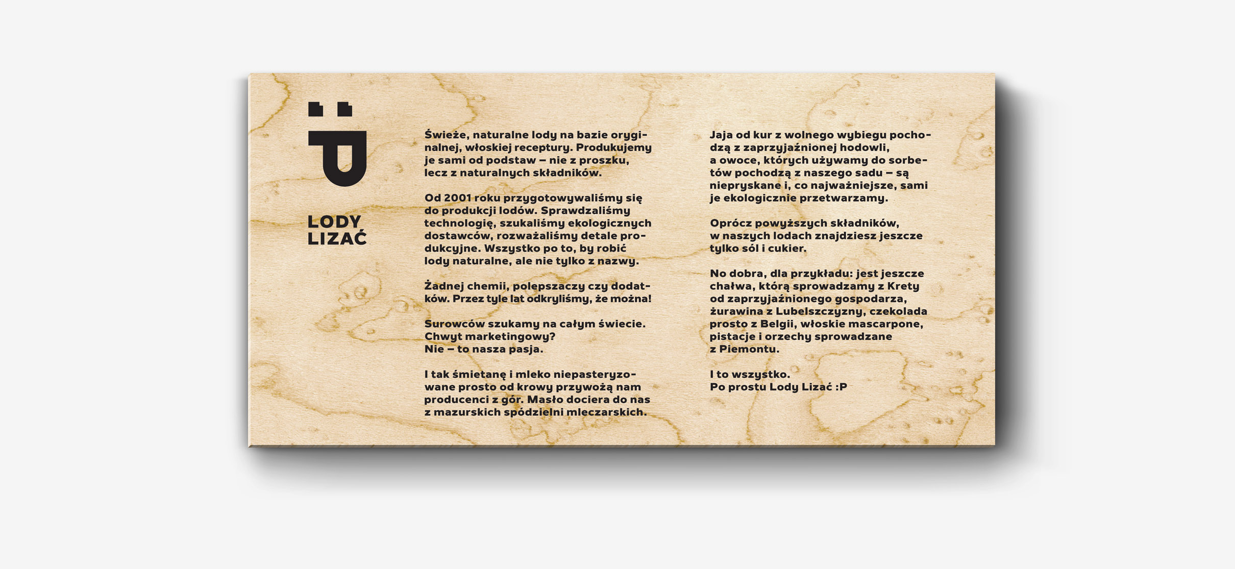
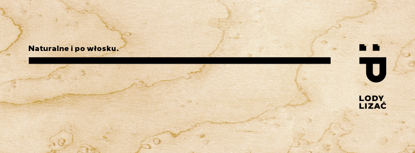
Fresh, natural ice-cream based on the original Italian recipe. Produced by
the owners of the brand from scratch – not sing any powder, but the natural
ingredients instead.
—
When I was asked to create the visual symbol, a new brand was to be called Gelati
or Jedyne (The Unique). In response I tried to convince my client that such an
exceptional product should have an equally unique name. This way my work began
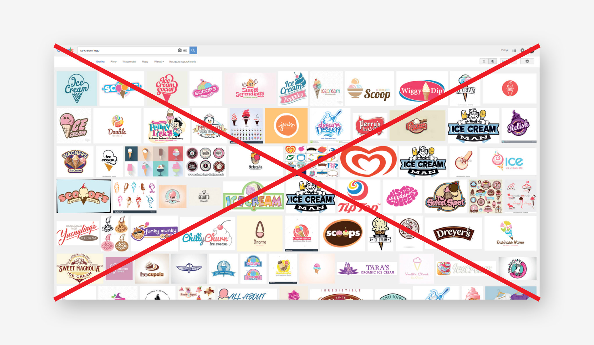
with a research and proposals of a name for the brand. Next I wondered how to
show it from a completely different angle than other natural ice-cream brands.
—
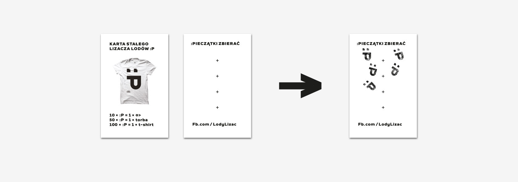
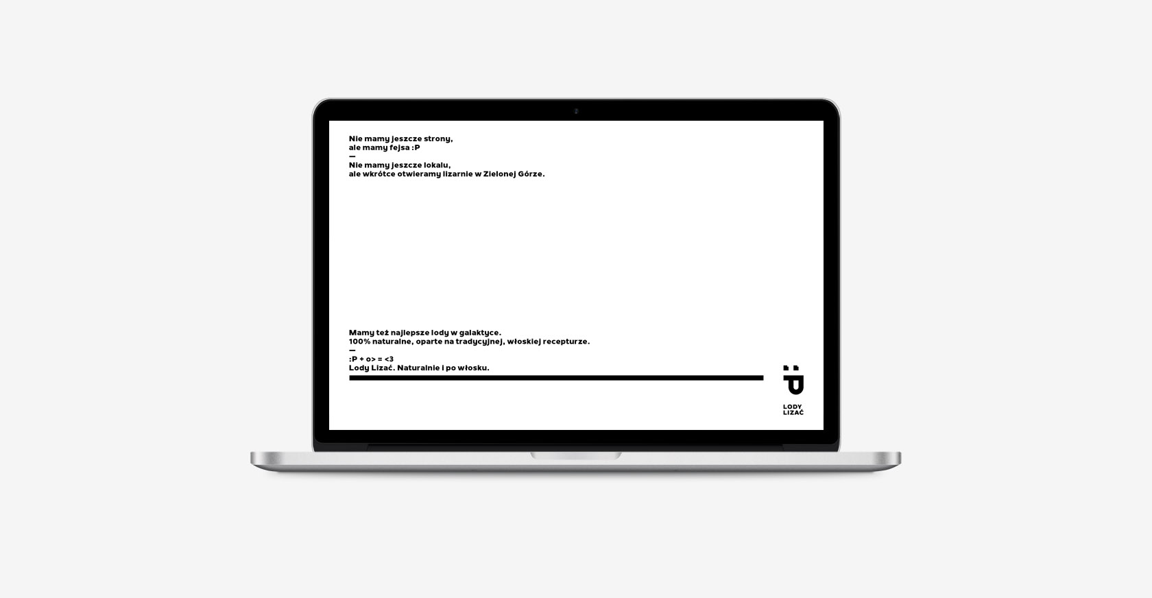
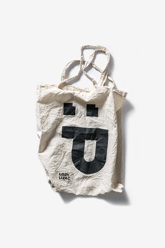
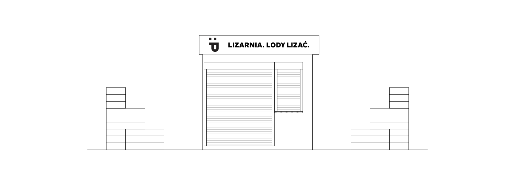
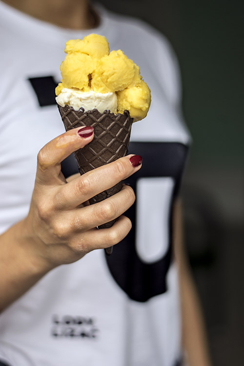
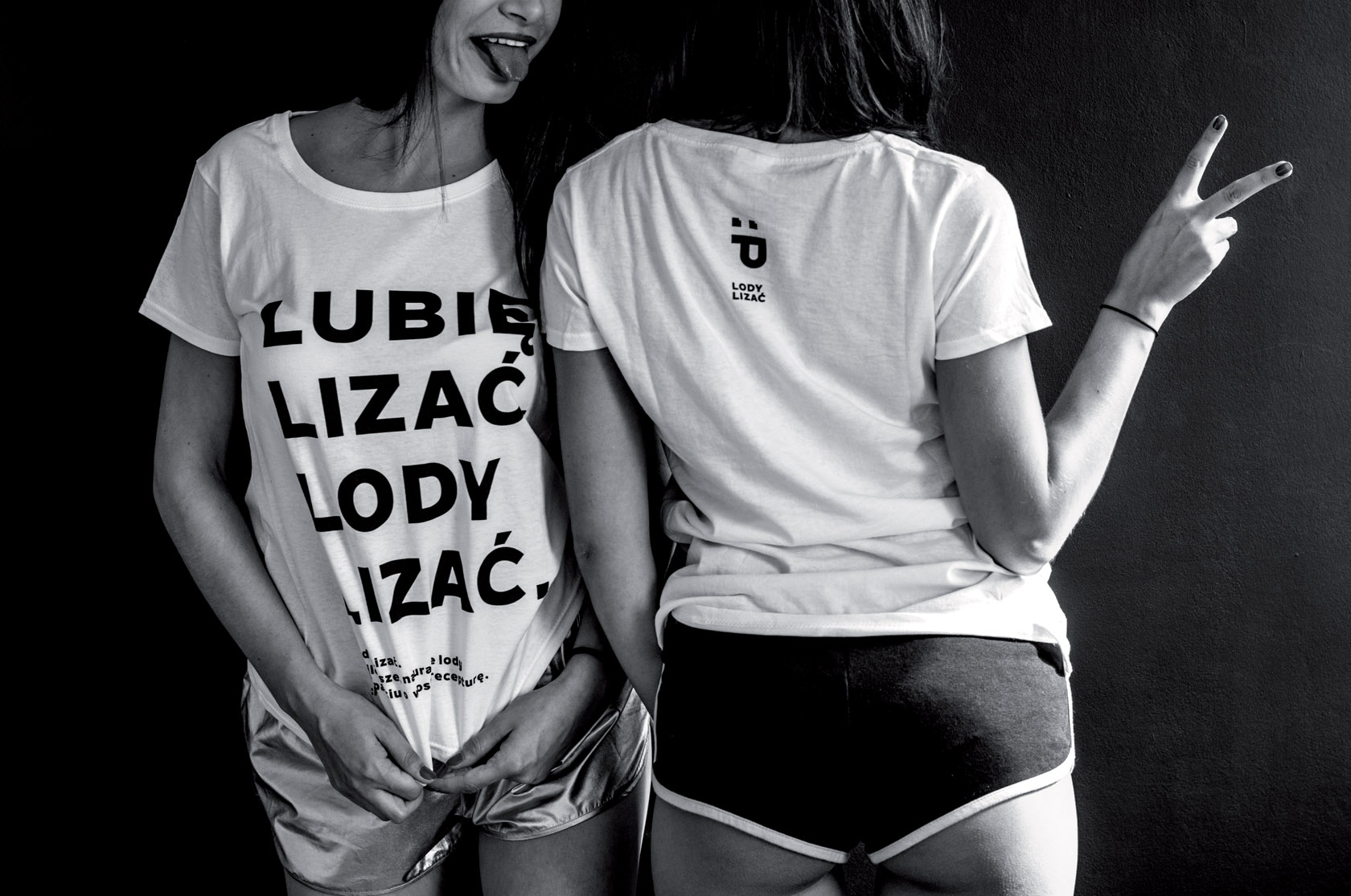
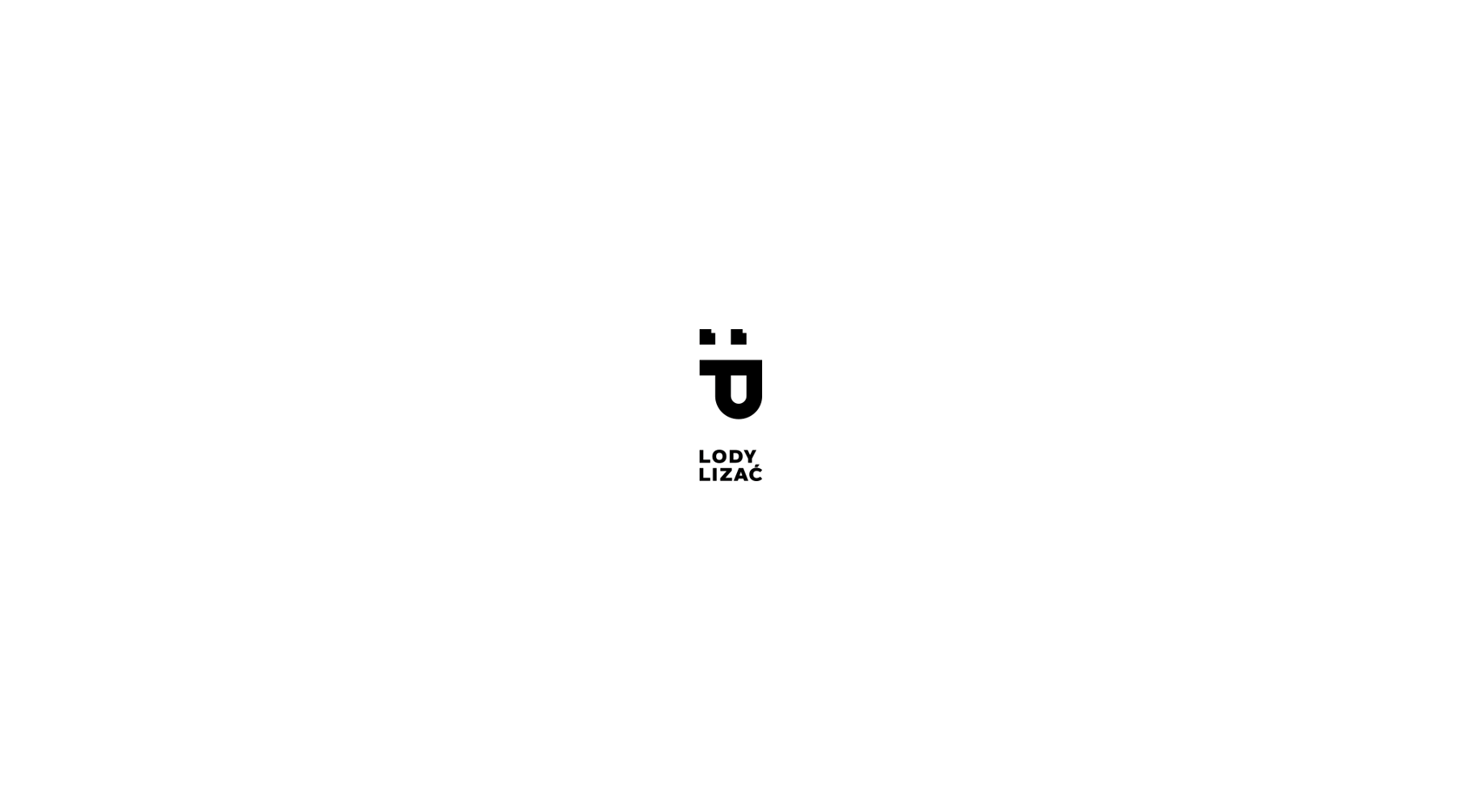
Lody lizać (literally: lody – ice-cream, lizać – to lick) is a wordplay derived
from a popular collocation “palce lizać” (lit. to lick fingers), which is used
to express that something is really delicious. The concept refers not to
the product itself but to the activity related to it, which provides the gustatory
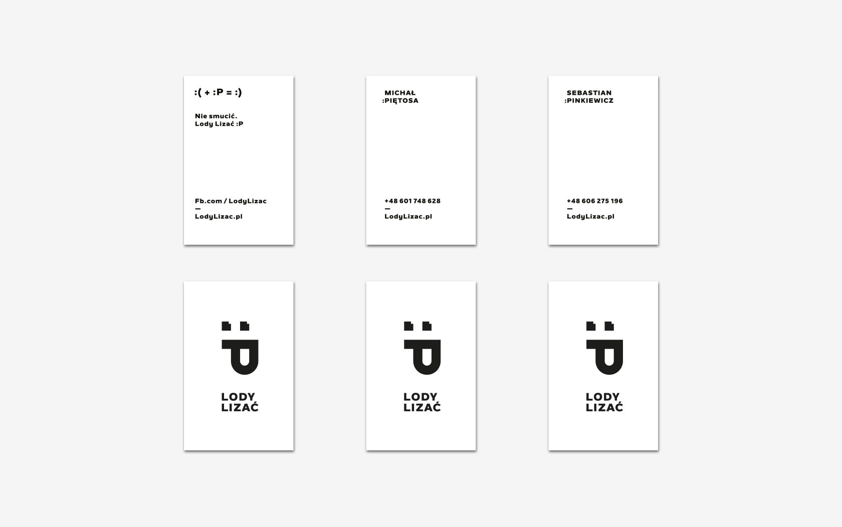
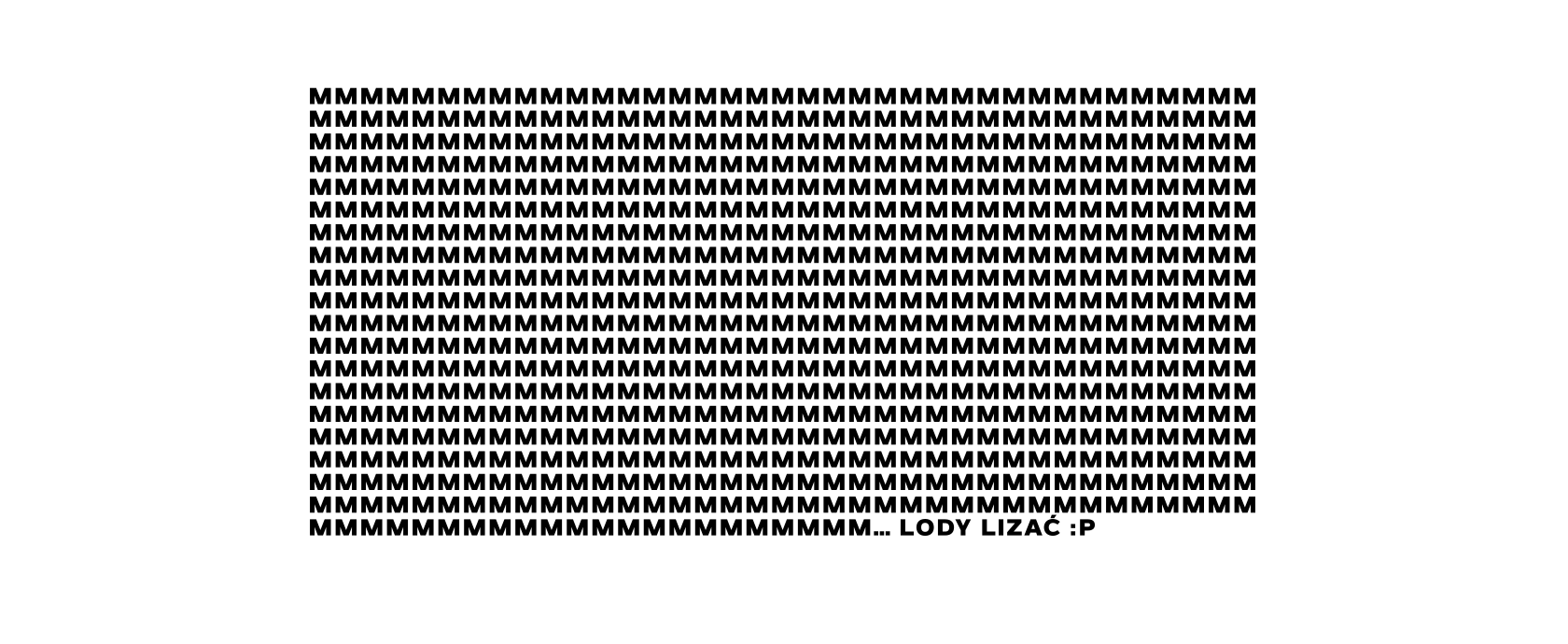
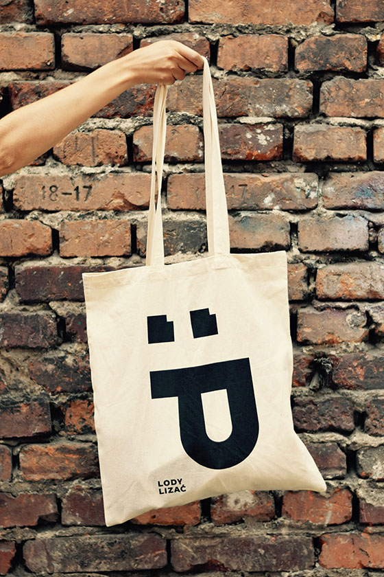
pleasure. The graphic symbol refers to the emoticon, so it can be reproduced not only
in the graphic form, but in the text as well :P.
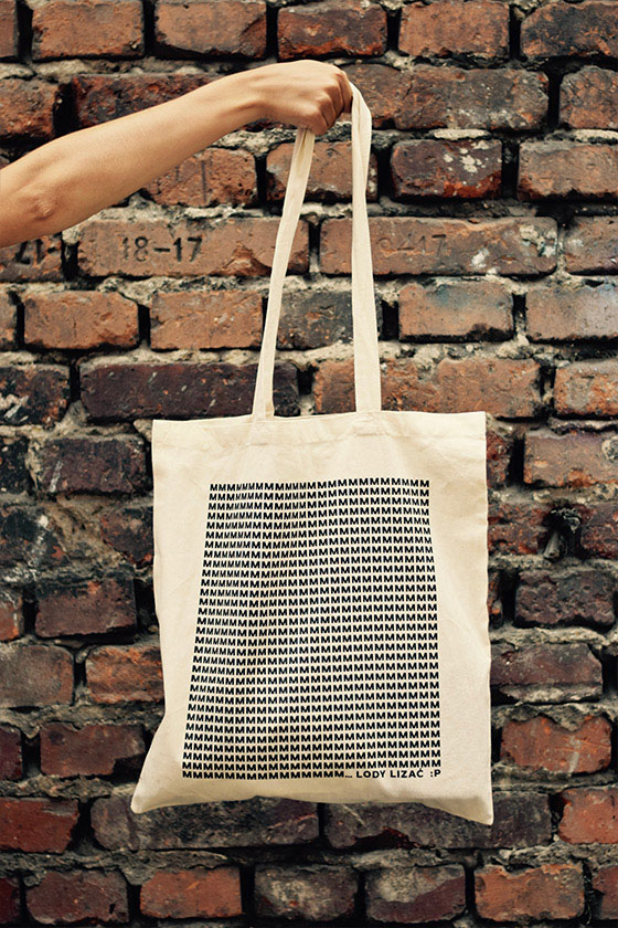
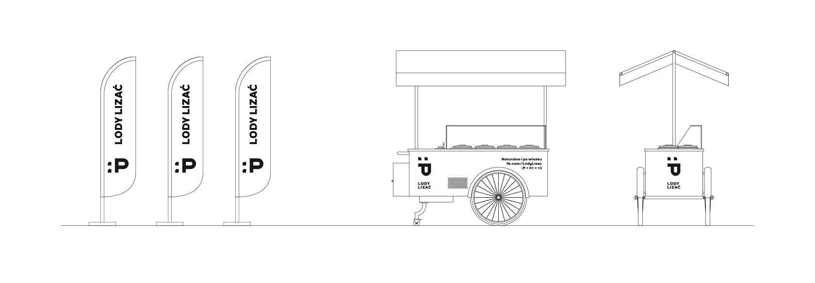
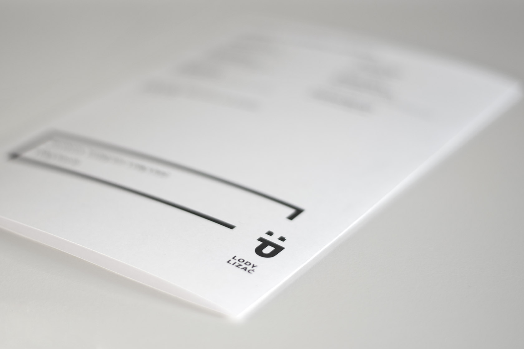
The graphic symbol and the brand’s name have
been followed by a specific language of communication: thanks to its simplicity,
placed in an appropriate context, the mark may also function in the company of some
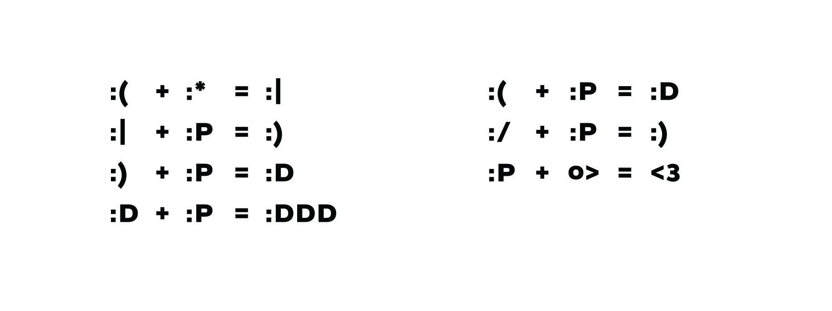
words e.g. :Power, :Patrick, :Pyyycha (Yummy). Instead of traditional advertising
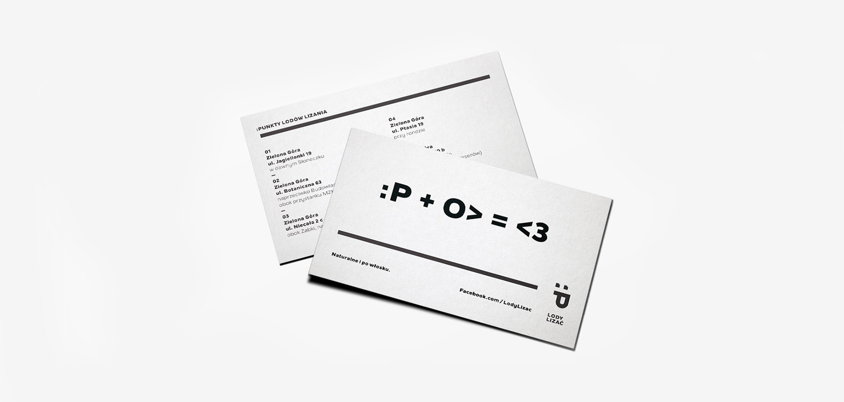
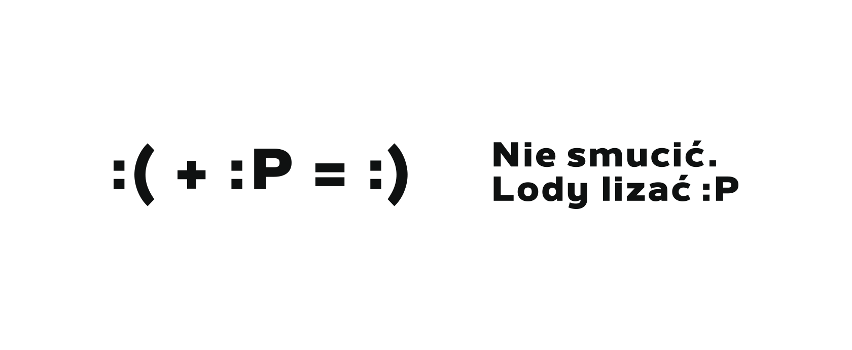
slogans, we have decided to focus on a combination of mathematical operations
including other emoticons and creating new such as O> (representing ice-cream cone).
—
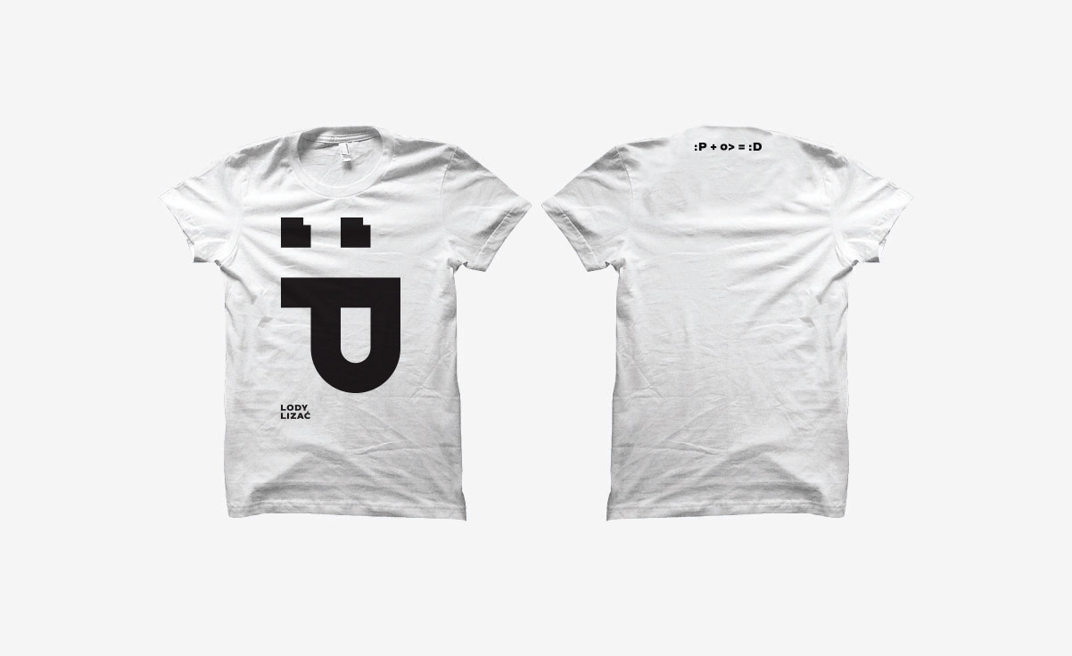
Colorful cones, delicious and healthy ice-cream and a new language of
communication gained consumers’ approval.
:P + O> = <3
—
Typeface by: Galin Kastelov.