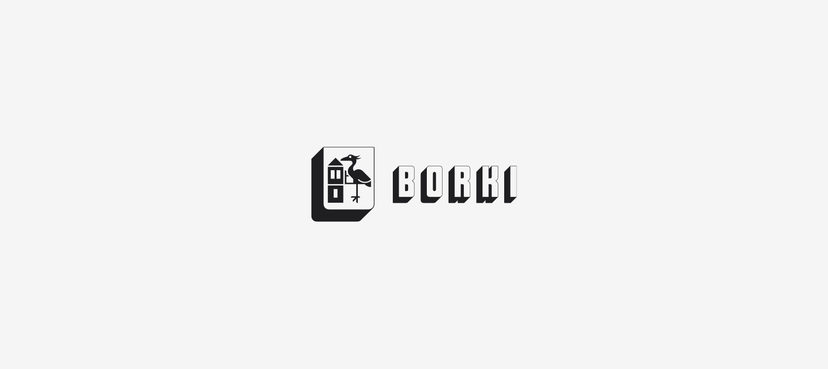
Borki
Borough
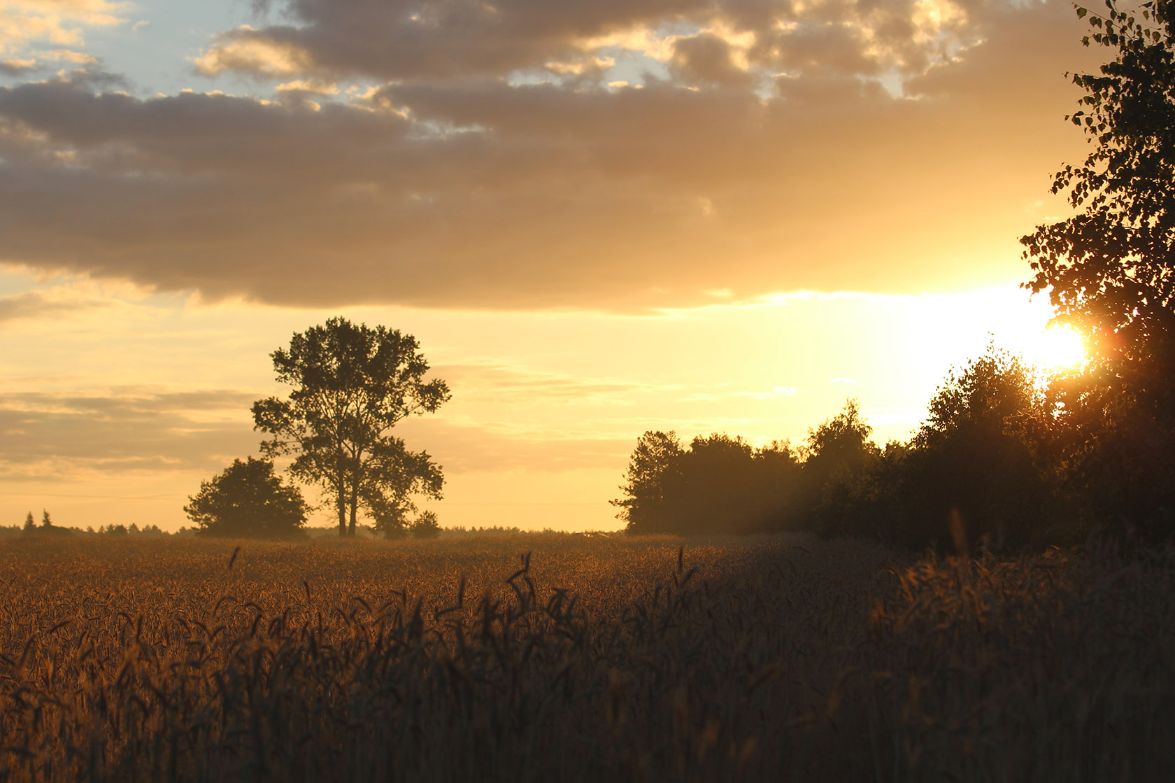
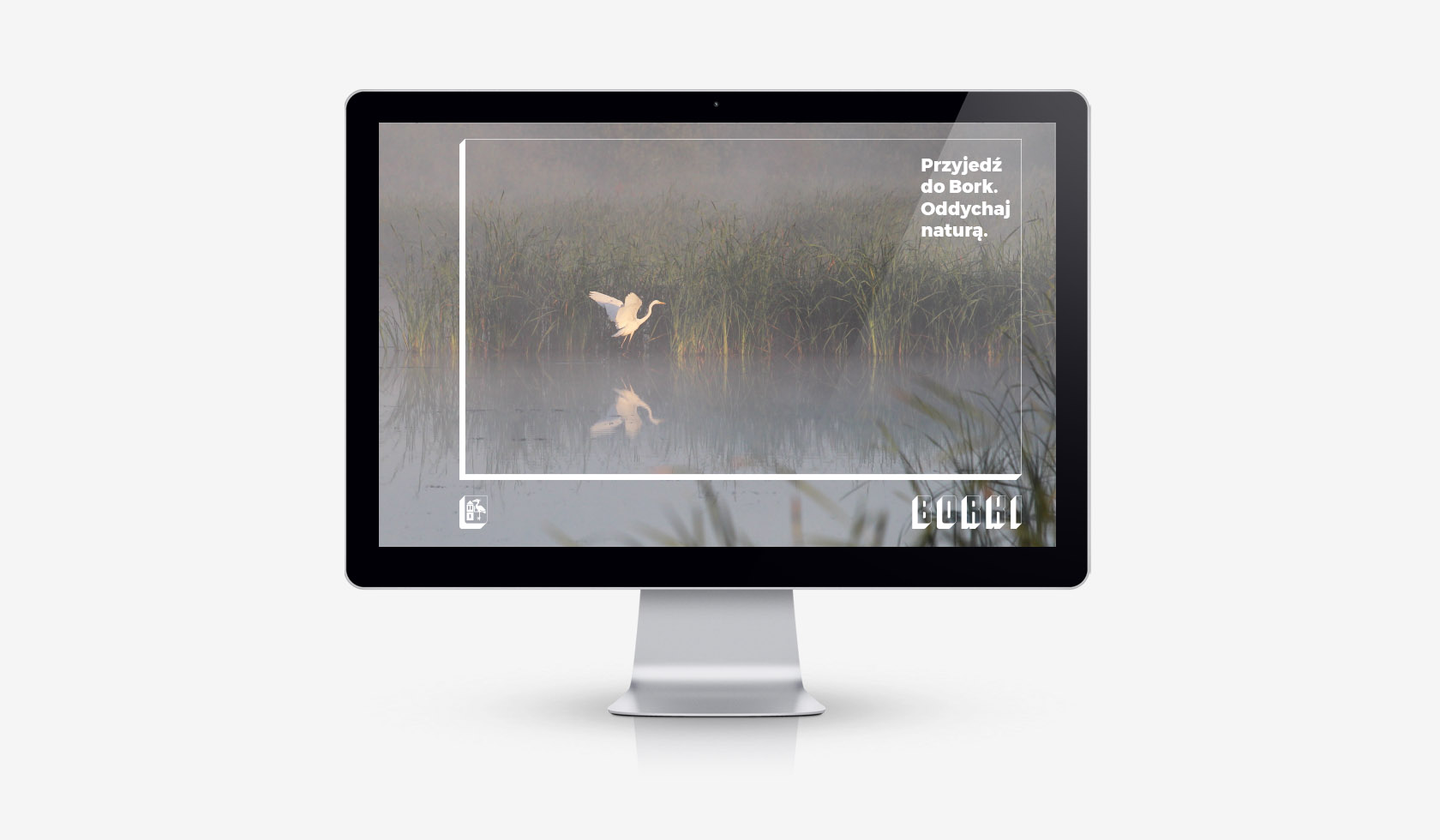
Located halfway between Lublin and Siedlce, 80 km from the border with Belarus, Borki borough apparently
does not stand out with anything special: fields, forests, PGR buildings… It is simply natural. It is that
which Borki captivates, and that which it wants to attract tourists and investors with.
—
Before I accepted the commission for creating a identity of this region, I went there to spend a few days
myself. First, I wanted to look for a starting point, do some research, and only later talk about any serious
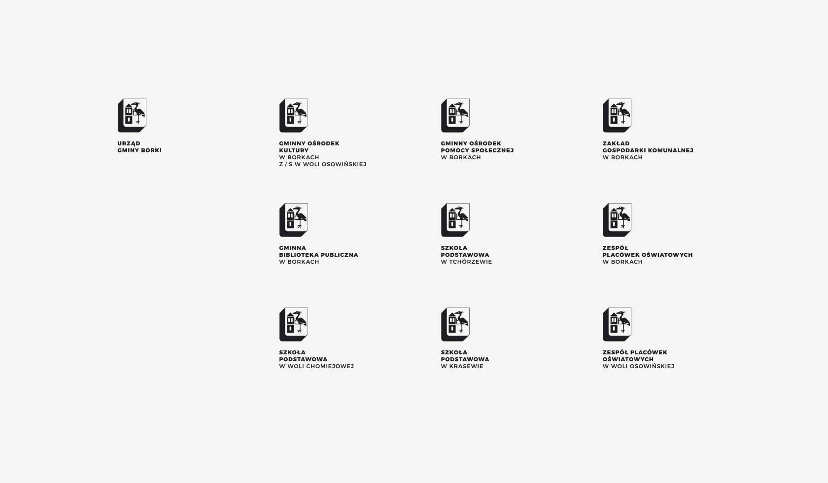
cooperation. I traveled around the whole borough, I got to know the villages that belonged to it, important
places, I met with important residents, I visited offices, libraries, cultural centers, schools, chambers
and other institutions. I spoke to both employees and people on the street. I traveled by bicycle and even
hitchhiked my way around to meet more people.
—
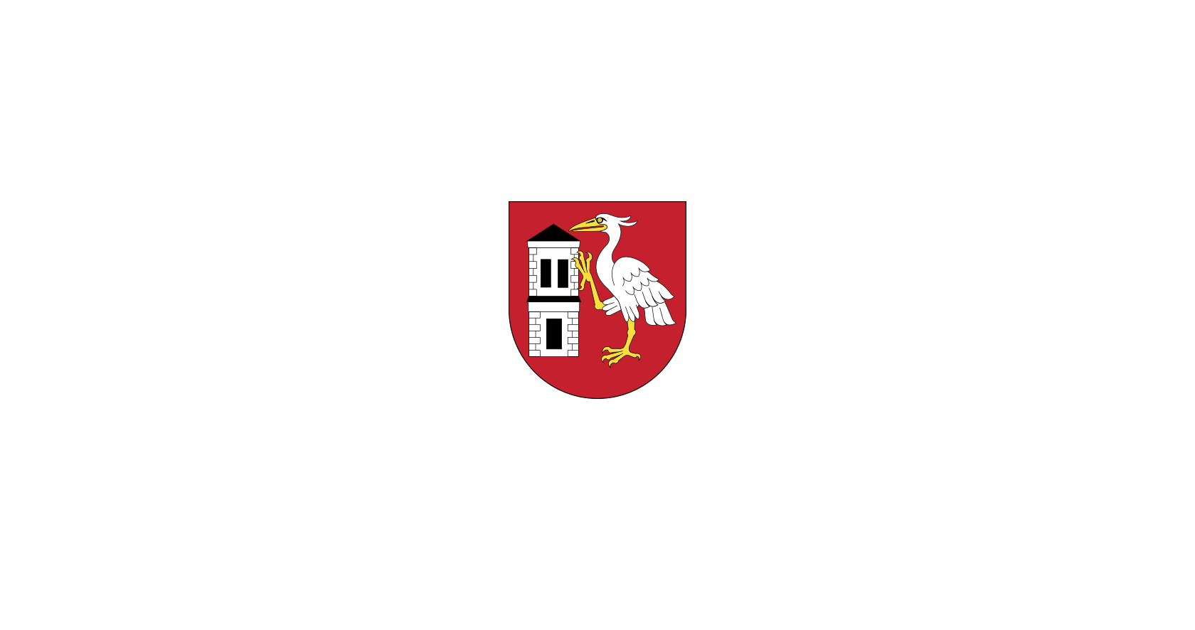
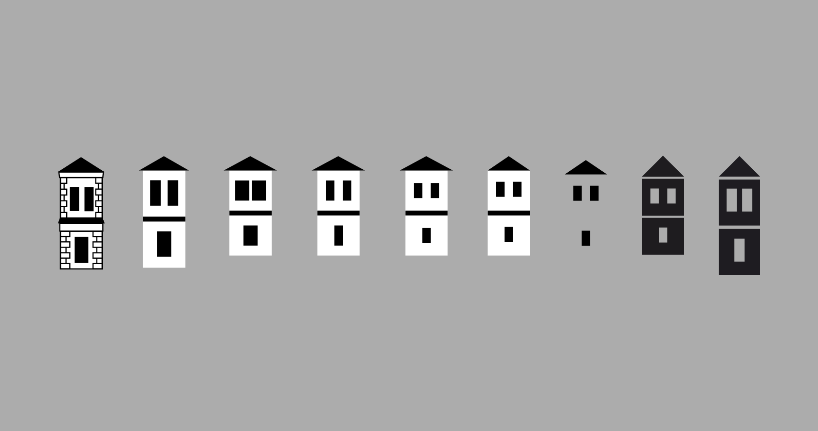
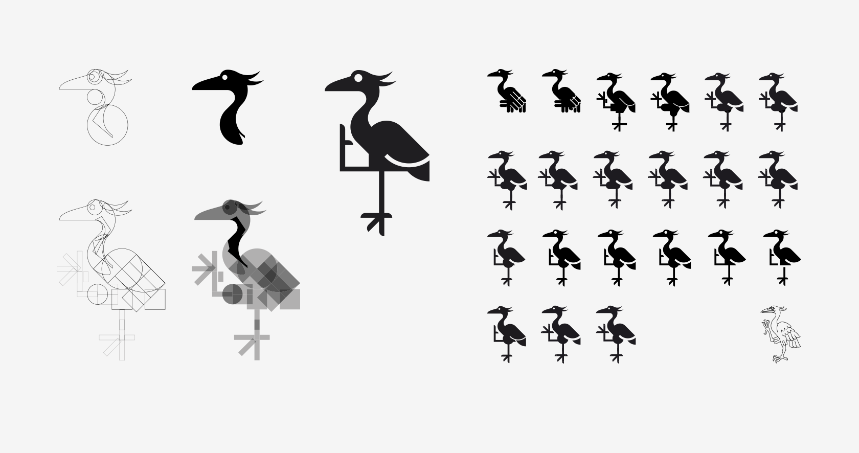
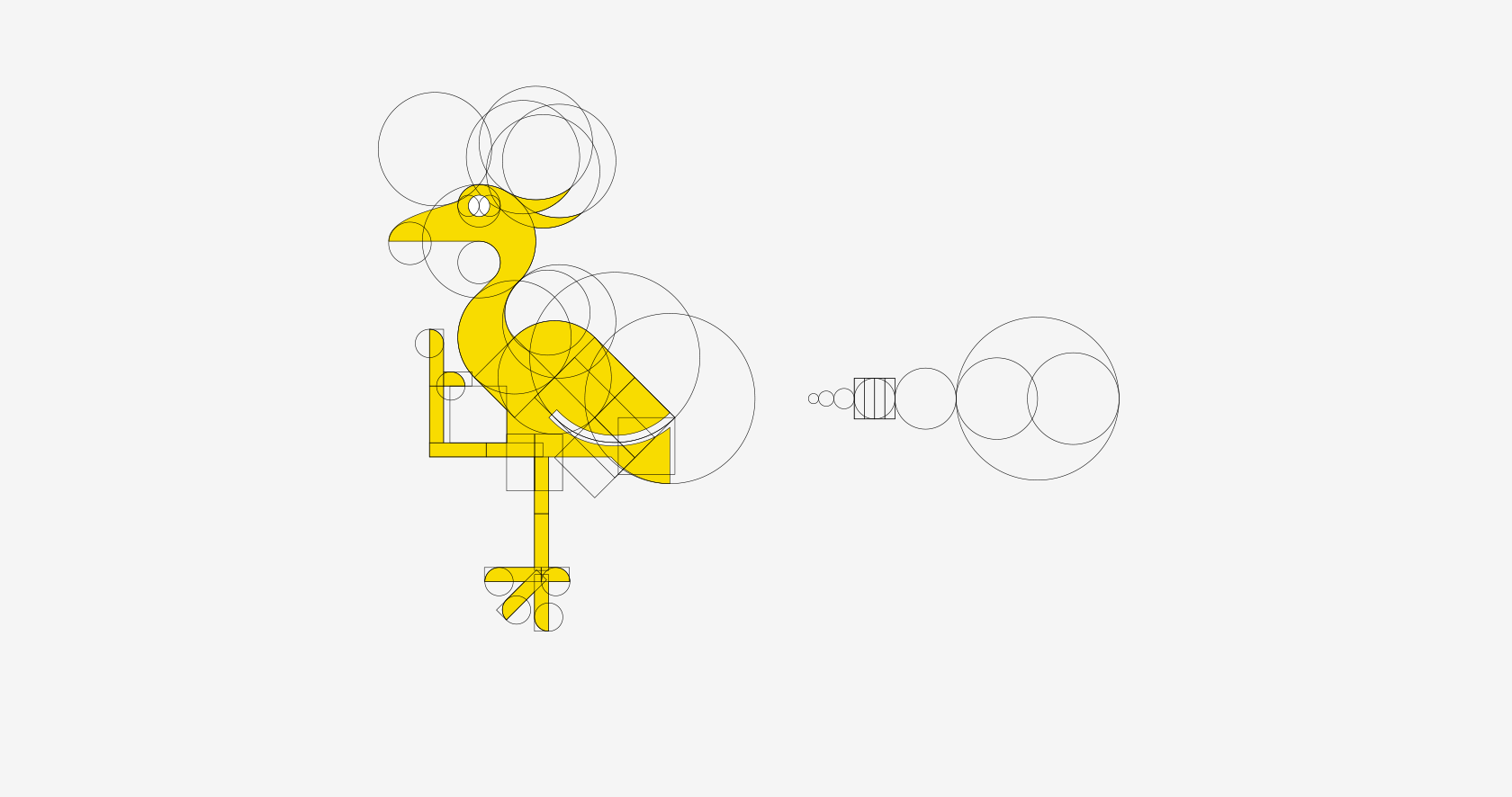
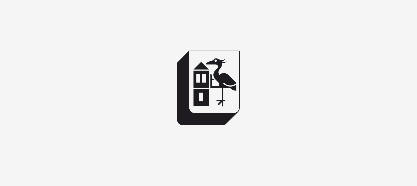
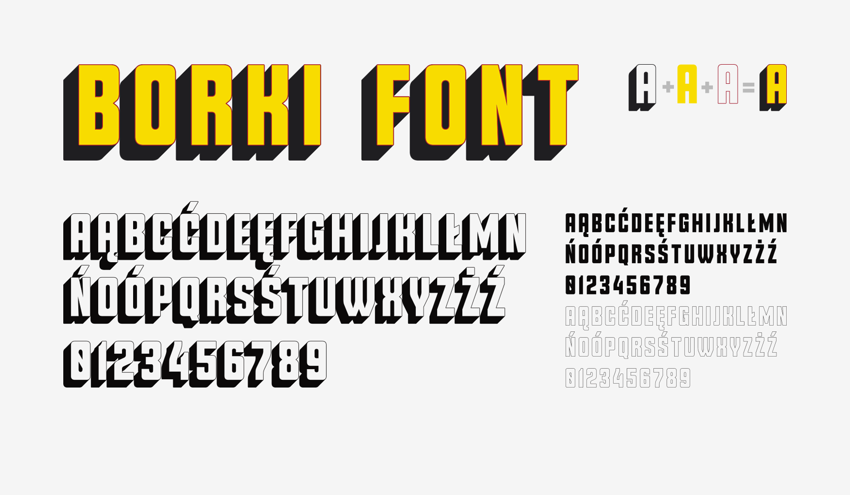
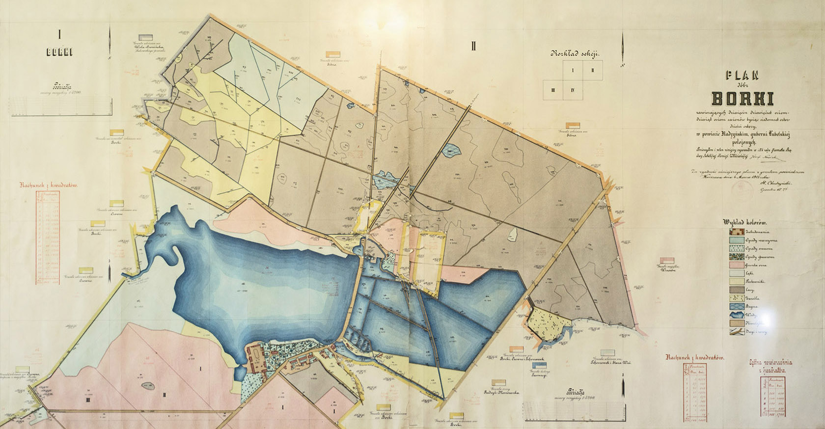
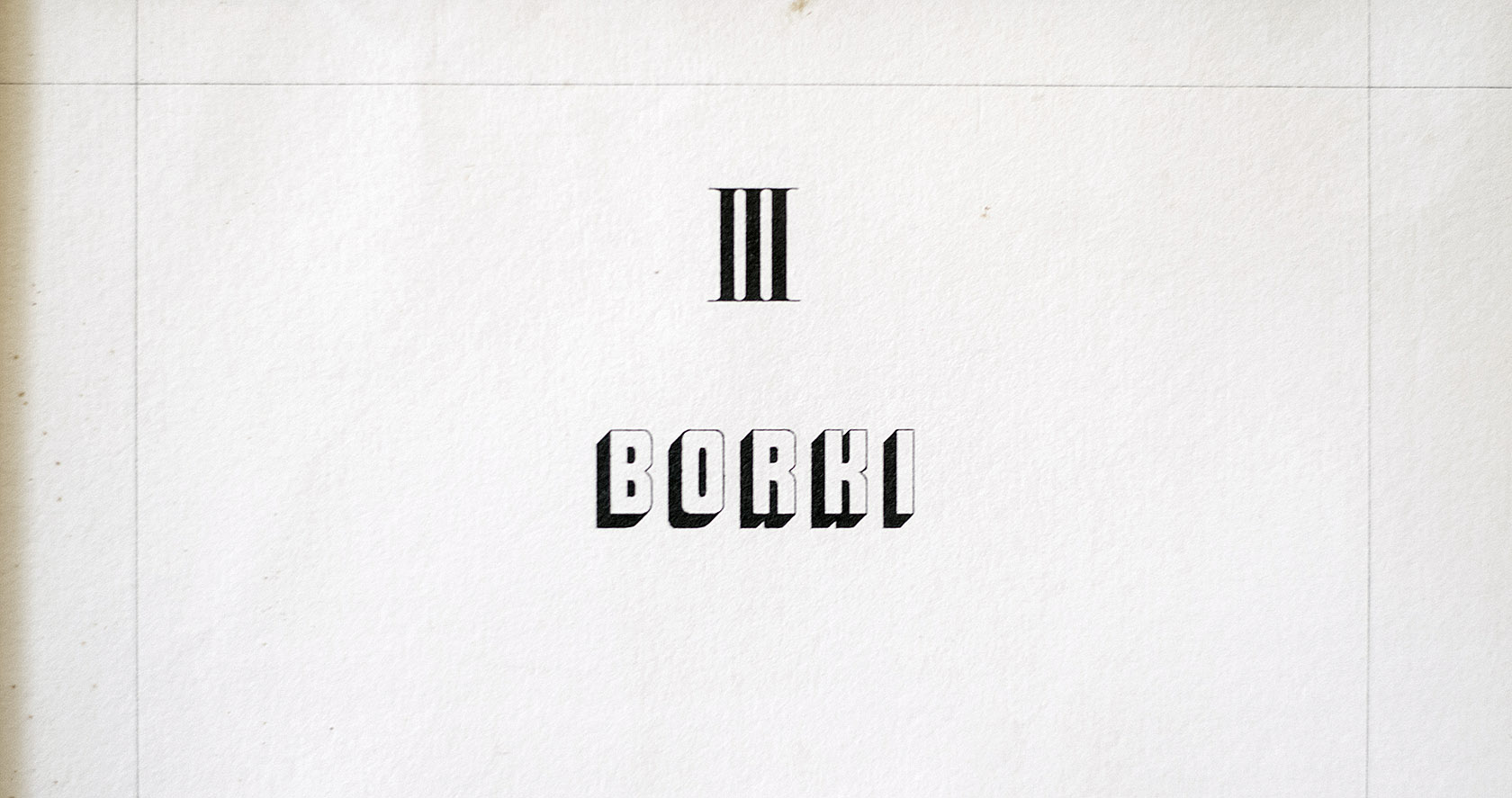
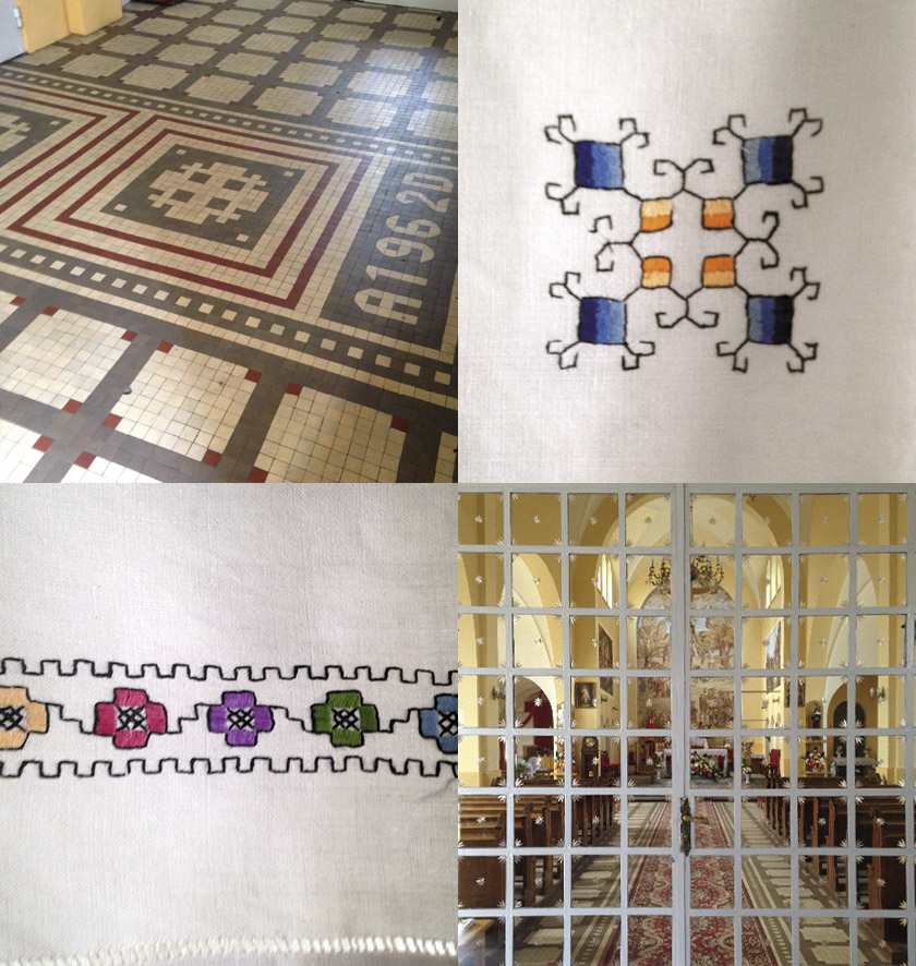
The key moment was the visit to the Regional Chamber, where I came across a map from 1914 made by Józef
Nowicki (Gieometra Rządowy Lubelskiej Komisji Włościańskiej). The handwritten letters found on it were
both old and very modern – something very timeless. The construction principles of these letters
(roundings, right angles and 45°) have also been found in several other places, for example in the local
church and on the tapestries.
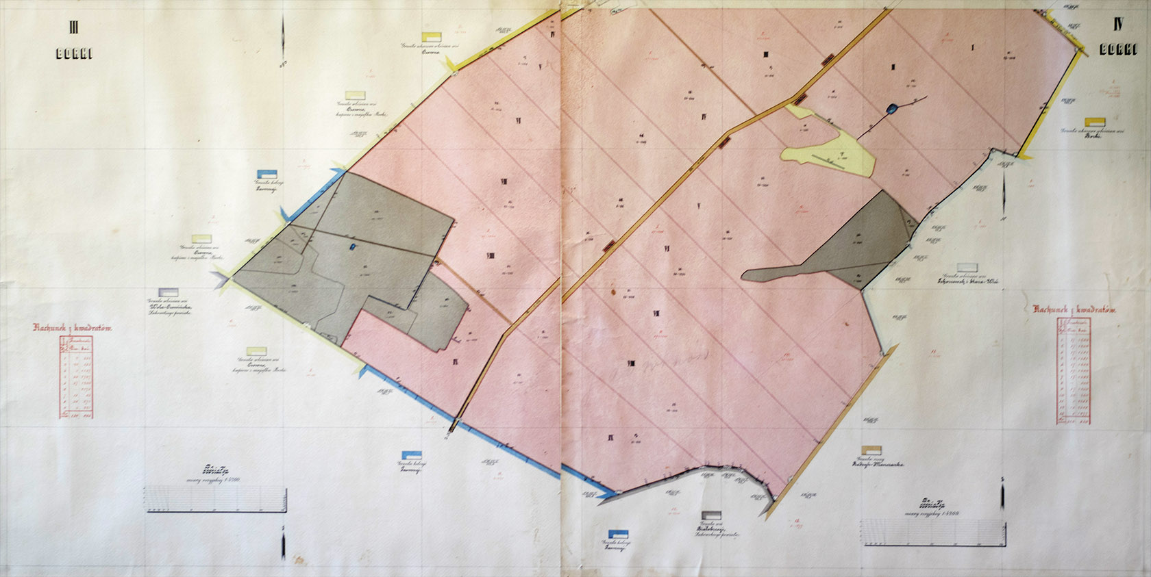
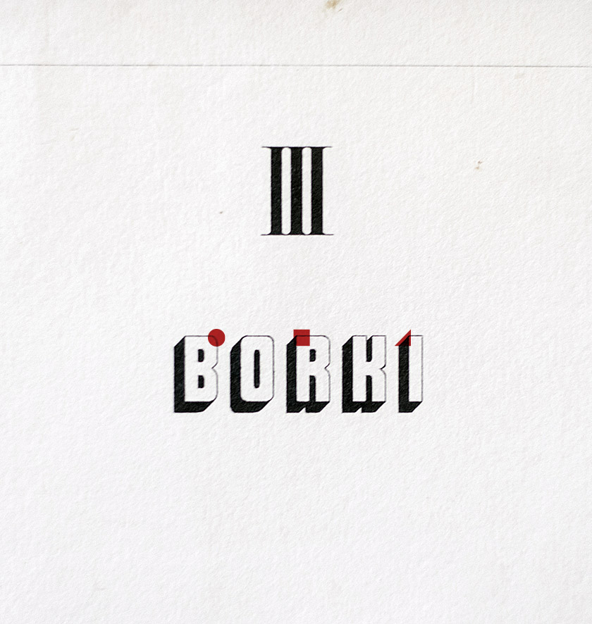
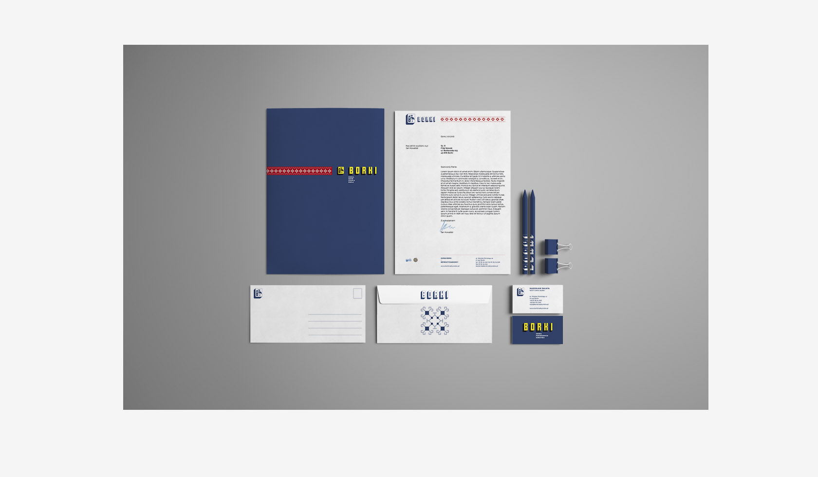
Since the borough already has a strong, historically conditioned identifying element in the form of a coat
of arms, I decided that the only valid way to design the identity would be to simplify it – according to the
rules dictated by letters from the map. In the meantime, Pillcrow studio
has devoted itself to developing the entire typeface in three styles.
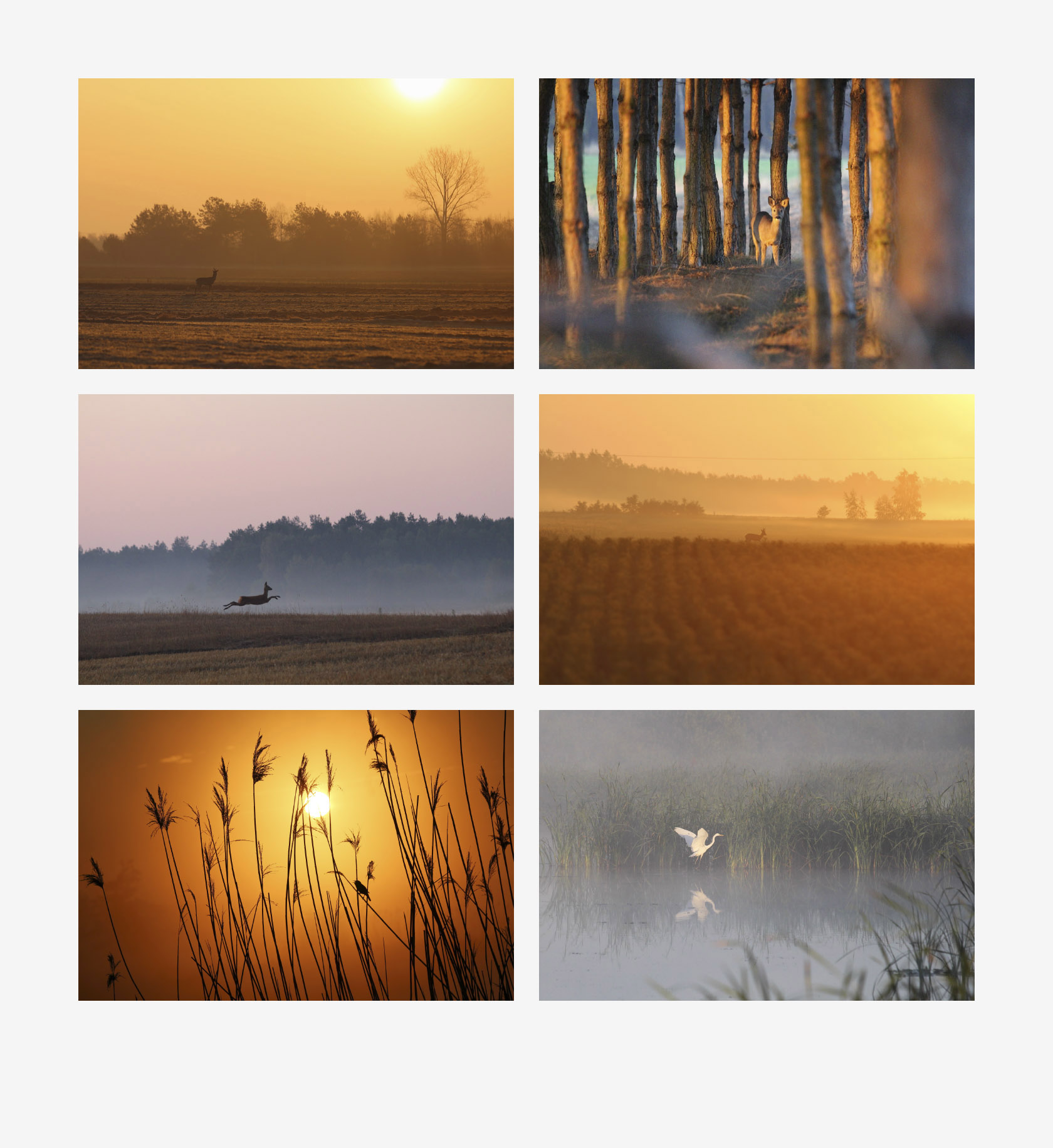
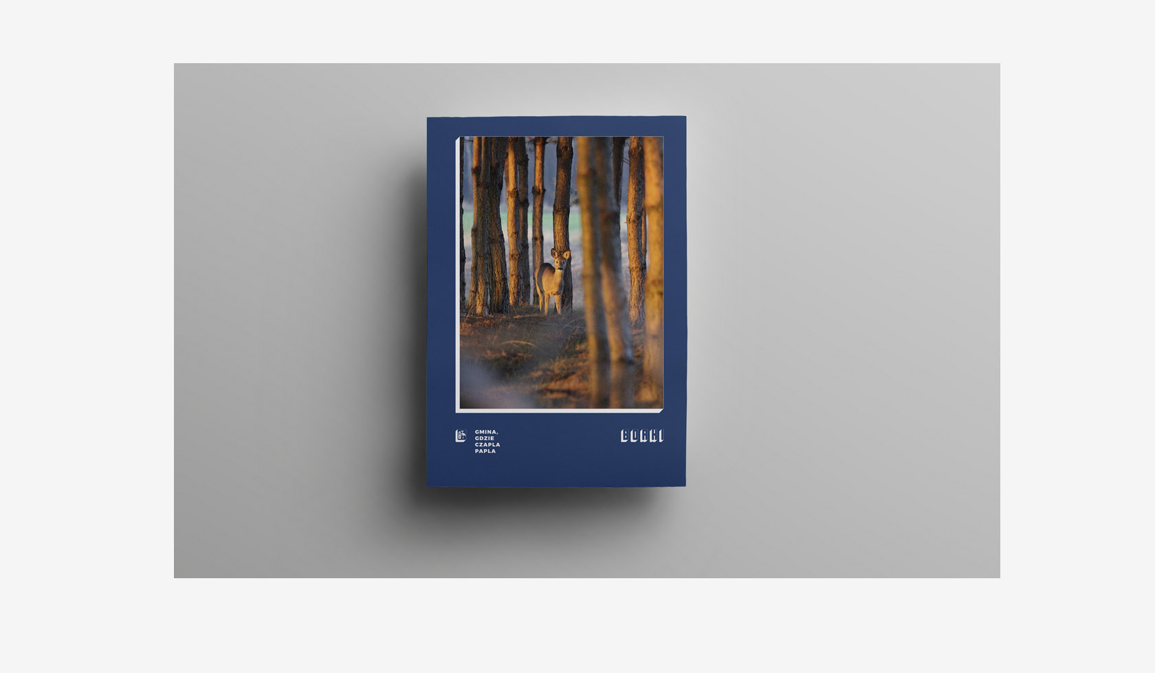
It was important for me to extract what is valuable in the whole commune – using the maximum of local
resources to arouse the residents pride in their place of residence, but also to build their personal
relationship with a new (new – but not completely new!) form of identity. I wanted this identity to be
a tool, that will help them look again at what they already have. That is why, complementing the identity
are photographs by the inhabitants of the commune – mr and mrs Lipko, patterns of tapestries and exceptional
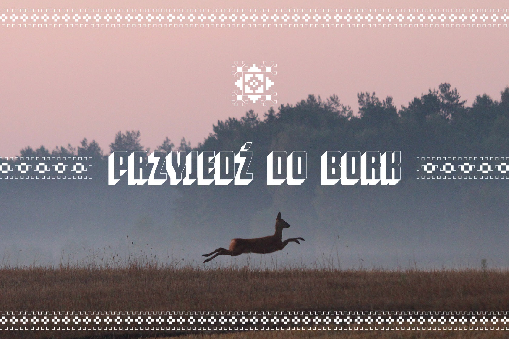
regionalism revealed in one of the varieties of come to Borki – “przyjedź do Bork” – not “do Borek”,
and not “do Borków” as any non-resident of the commune would say.
—
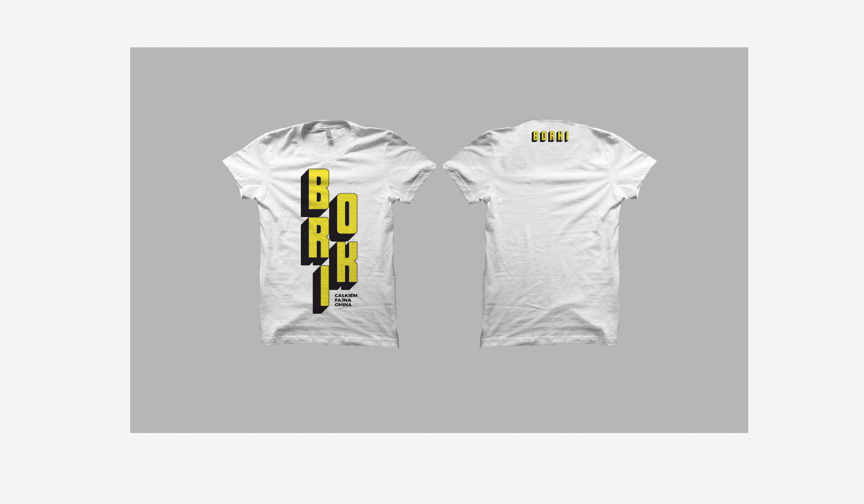
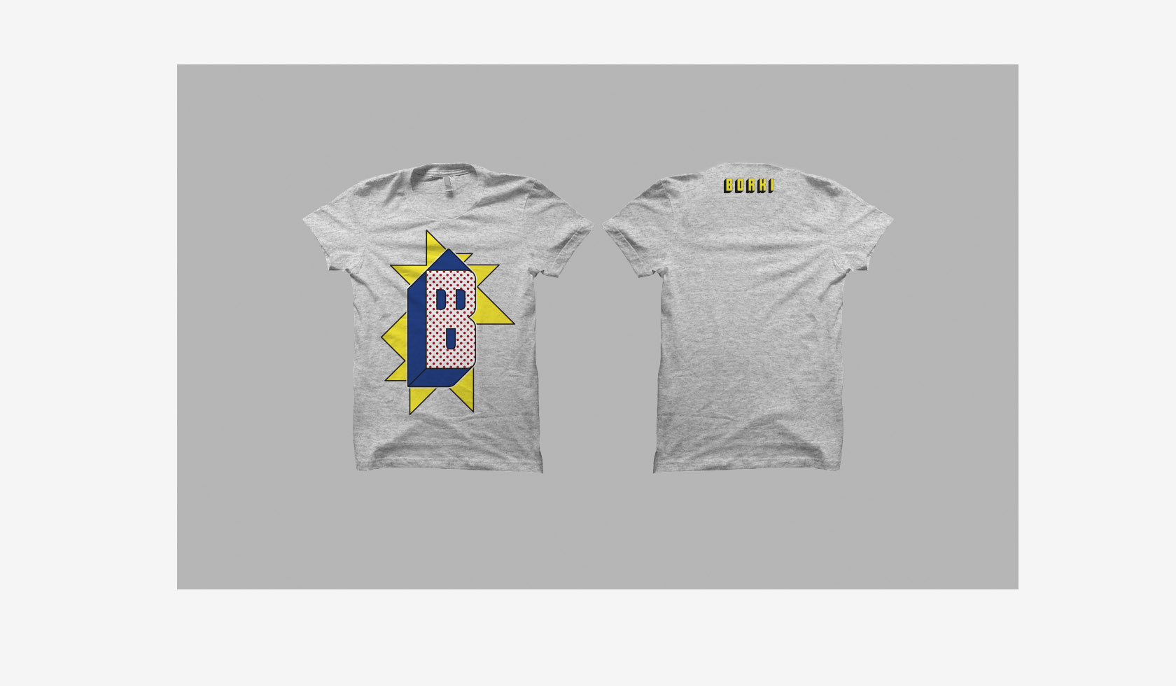
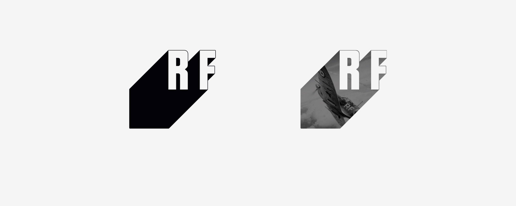
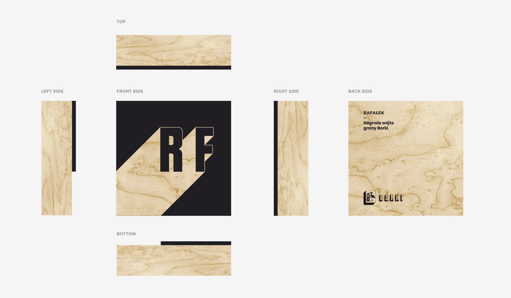
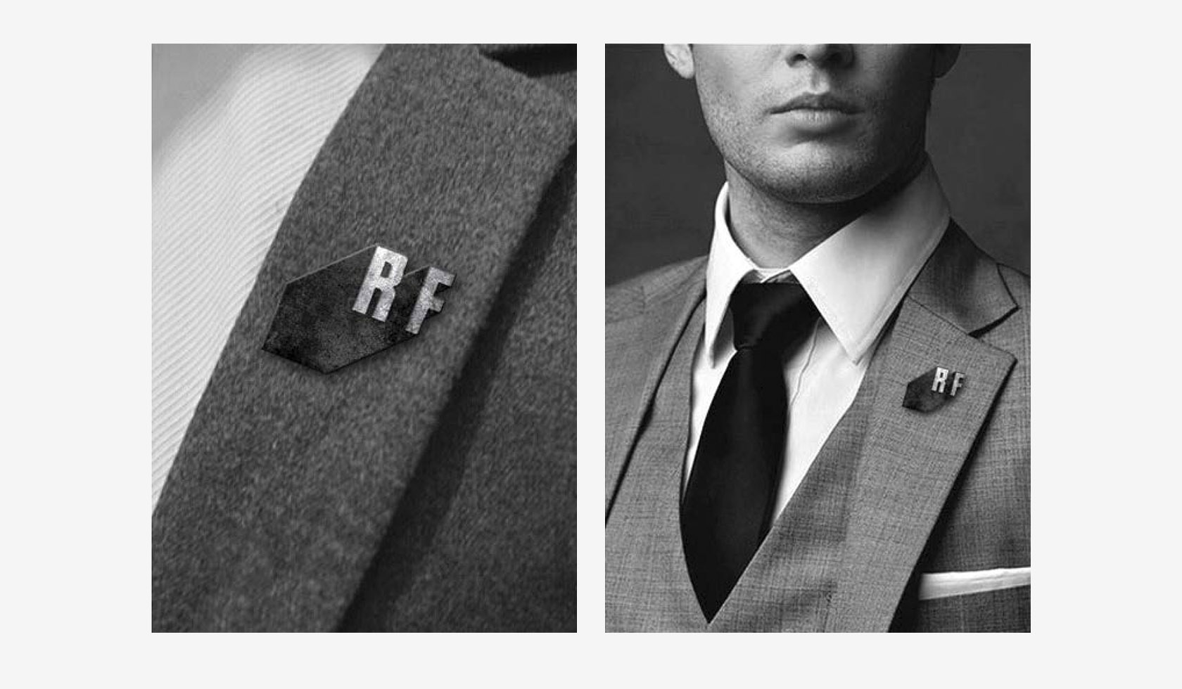
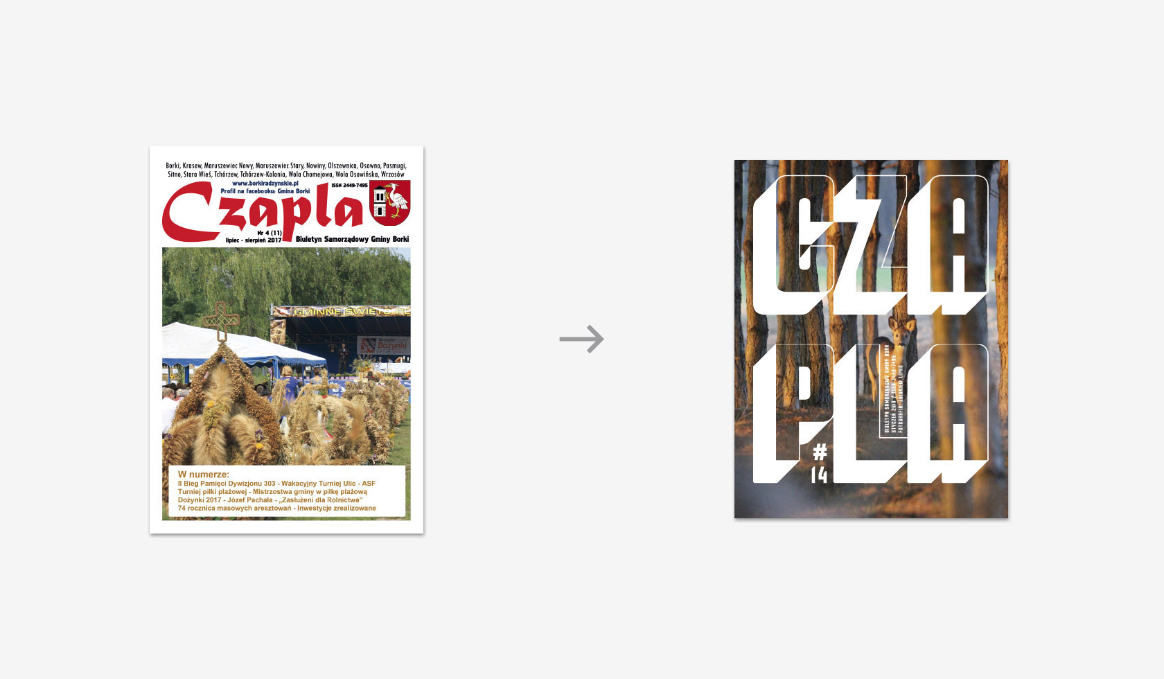
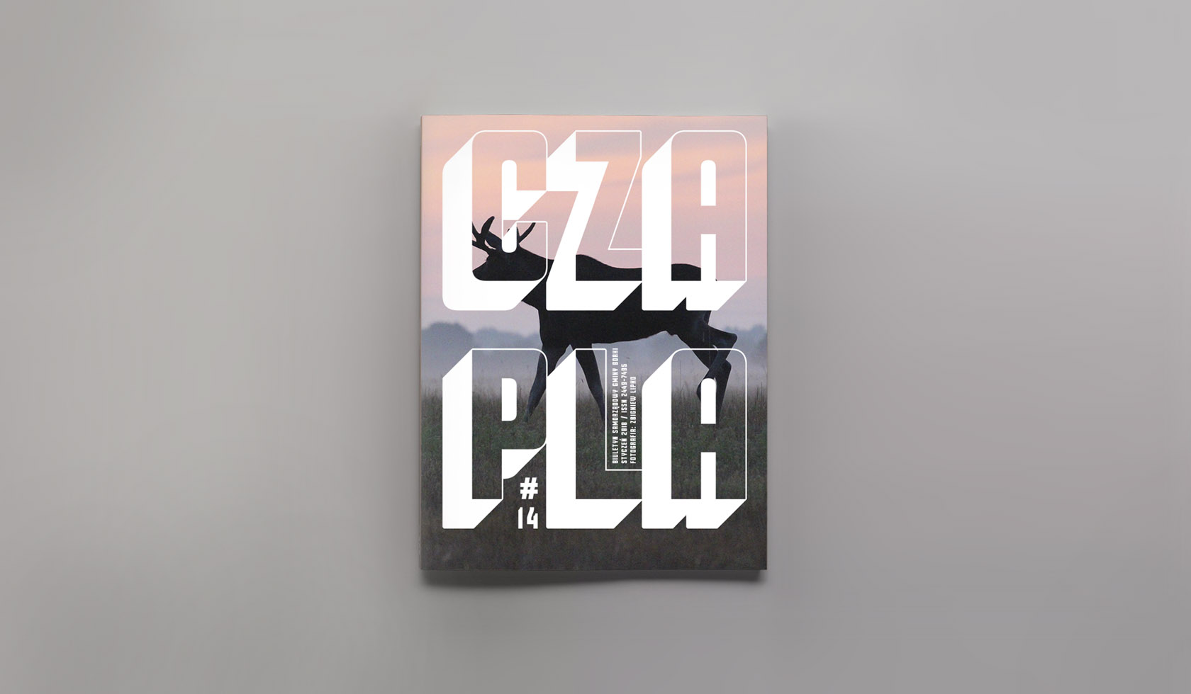
The scope of the project also included development of the logo, badges and figures from the competition
“Rafałki” and redesigning of the “Czapla” magazine.
—
Borki font design: Pillcrow
Photos: mr & mrs Lipko